First commit
Hello there! So yeah, I’m launching a website, mostly about the web, accessibility, testing, and a little about myself (maybe a lot if you count all of the opinions).
Why I’m building my own site
There are many ways to build a web presence today. I chose my own site because I need a personal sandbox for experiments and a purpose to use and learn new web tech myself.
I plan to share each post on LinkedIn and use the comment section of that post to engage further. I’m happy to take feedback on this approach or anything else.
My plans for the site
This site will mostly be a blog at first. My topics will largely be about web accessibility, primarily testing for accessibility and how it can, and cannot be automated. That’s the plan anyway.
I also plan to use the server to host a few experimental tools, mostly related to testing for accessibility. Not sure what they will be exactly yet, but stay tuned I guess.
The tech behind this site
It’s been a while since I created a website from scratch. The last time I did, it was largely using LAMP stacks. React has been hugely popular for about a decade, so I chose it to get more up to speed with broad industry practice.
I’m using the Astro for the framework. I wanted to have a mix of server- and client-side rendering to help keep my dreams flexible. I decided not to go with Next.js due to some recent controversial actions from their CEO.
I’m using markdown for blog posts with Jekyll for metadata about the posts.
At launch time, I’m not using any compilers for CSS or JavaScript, I don’t expect I’ll need them for this site, but maybe that will change.
On the server side, I’m using Linode to host the site. They are relatively low cost and come with little ethical baggage to my knowledge at this time.
Use of AI
Adrian Roselli posted about his use of LLMs on his own site recently and I largely agree with his views on the subject. I don’t plan to use any AI generated images on the site and I won’t use AI to write my content. I may take a step further and ask AI to proof read my work from time to time, because I need to face facts, I’m not a great word person. If I do use AI in any visible ways, I will call it out and I also don’t plan to dwell on AI and the industry like many are doing these days.
Adrian’s post doesn’t cover his use of AI beyond this however, and I’d like to talk a little more about that. I have used AI to help provide recommendations on how to set up my site, that includes finding the right tech to use, but also helping me to solve tech problems, generally tech problems that I don’t have any interest in learning in depth, like how to set up continuous integration for the first time. Most of the time I will be evaluating how much energy I think I’ll be putting into a task, and, although AI energy costs are large, if I think the amount of personal energy, and all of the servers I would need to engage with (watching YouTube videos for example) will likely outweigh the costs of a conversation with Co-Pilot, I’m generally ok with that decision. That opinion, of course, may change over time.
As I delve into accessibility testing more on my own, I expect I will have a few experiments that use LLMs to see what can be achieved. I plan to post about those experiments, whether or not they are successful.
Design
I’m no designer, but I have worked with enough to pick up a few tricks. Recently I was thinking about the posters I used to see way back when I worked in the music department at Dalhousie university (we’re talking sometime around 2005). I remember finding posters from shows that were put on by the music department in the 1960s and 70s. They were often sort of abstract but also made sure the important information was easy to see. I tried to emulate that style a little, I don’t think I achieved it yet, but I may keep experimenting with it.
I also wasn’t able to find posters that really matched my memories of those posters, the closest I could find was the following poster of a performance by Milton Nascimento in New York, which appears to be from the 1970s (maybe I’m way off on that, maybe someday I’ll do further research on this…).
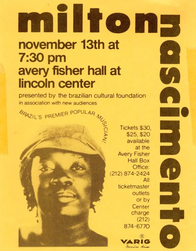
From this poster I used a similar font a colour scheme. I also applied vertical text to my home page as well as using a similar style on the image of myself on that page. That got me started and from there I adapted new styles for each layout. I like the text that follows an abnormal path, and although this can be done with CSS I decided it was not a great fit for any designs at the moment, but I might keep it in mind in the future. I specifically did not use the right justified text as it is often more difficult to read.
Accessibility self-assessment
That brings us to accessibility. At the time of launch, I ran a scan with Axe and I got no reported issues. That means I have no accessibility issues right?
Nope, I have a few things to talk about. But this kind of statement is what I’m going to talk more about in the future, having issues reported by tools like Axe doesn’t necessarily mean you have blocking issues, but there are also loads of issues that don’t get caught by automation. This is partially because accessibility is still subjective in some areas, but also because these tools can’t catch everything, at least yet.
Colour contrast
The largest issue I have on the site right now is the colour contrast used for my name. The contrast passes all automated accessibility checks because the font colour is detected as dark brown (#483016) on yellow (#ffde59) which produces a contrast ration of 9.26:1. However I’m rendering a dot effect over the text which reduces visibility.
How do we assess this?
WCAG SC 1.4.3 doesn’t cover this, it only covers solid colours on solid colours.
Does it pass? While it doesn’t strictly fail the success criteria, I don’t think many of us would argue that this method of displaying text does pass the test. Instead we need to find our own way of evaluating this.
Your eyes will interpret the dots as a combination of the two colours used, especially if you have reduced vision. To determine that text colour, I averaged out the pixels by reducing the image size. By doing that we get a text colour of #dbbc4c, that results in a contrast ration of 1.4:1, which is well below the minimum of 4.5 to meet AA requirements.
Actually… it does pass
Why? Because of this clause in 1.4.3:
Text that is part of a logo or brand name has no contrast requirement.
It does technically pass, but I could do better. In the end I feel like my name is so prevalent throughout the site that it doesn’t really matter, but this is very arguable.
However, this bring about another interesting thought exercise: how can we test if this a logo? Obviously as humans, we just know, but if we wanted to automate this, could we? How could we get there? I’ll leave that for a future post, those are the kinds of thoughts I’d really like to dive into in future articles.
I will also keep playing around with the design of this site, eventually once there’s more to evaluate here, I’ll come back for another self assessment.
What’s next?
I have a list of technical articles I’d like to start writing about, but I’d also like to post a more personal article soon about how I got into accessibility and how it’s changed me and my family. For technical articles, I’d like to start working on a series where I explore each WCAG success criteria one by one and talk about manual and automated assessment, along with interesting edge cases to consider and how WCAG might do better in version 3.
Discussion
You can view and participate in a discussion about this article on LinkedIn.